The Opportunity
Branding Brand is a Pittsburgh-based company that creates mobile sites and apps for ecommerce companies. Like many businesses, its revenue model depends on a healthy client conversion funnel. For many years Branding Brand received tons of leads, many of which converted, but the landscape of ecommerce changed dramatically in recent years.
When mobile commerce was new and companies weren’t sure how much to invest in it, they really just wanted a mobile presence. As a result, m-dot or standalone sites like the ones provided by Branding Brand became the standard. Soon it became clear that not only was mobile here to stay, it would soon surpass desktop in terms of traffic. It was no longer enough to simply have a mobile presence, so companies are really starting to invest in their omnichannel experience. A lot of retailers moved towards responsive solutions, and many are invested in in-house teams to implement them. The changing landscape created a need for a new business model for Branding Brand. As a member of the product team, we were tasked with creating a product to generate more leads and prove the value of a partner like Branding Brand. That’s where the Branding Brand Index, or BBI, came in.
Discovery
We created a cross-disciplinary team to explore the problem space. Our goal was to design a minimum viable product that was valuable, feasible, and usable. Our product manager was in charge of making sure it was valuable, our front end developer evaluated feasibility, and I was responsible for designing an easy to use product.
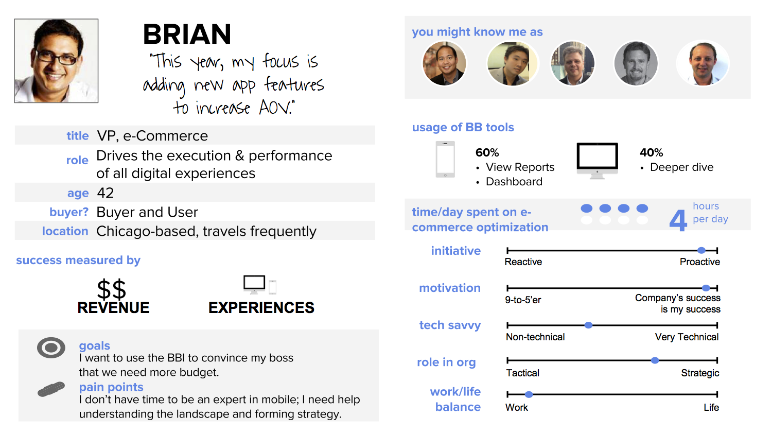
We began by talking to our users and traveling to offices across the country. We interviewed current clients as well as clients who had recently left. We then took what we had learned about their needs and translated them into user stories and personas.
We converged on creating an online tool that evaluates an ecommerce brand across various platforms and form factors. Based on conversations with our clients, we knew it was important to provide both quantitative numbers as well as qualitative evaluation. We assessed various factors across categories such as usability, performance, content, and provided an overall score that brands could use to compare themselves within the industry.
Ideation
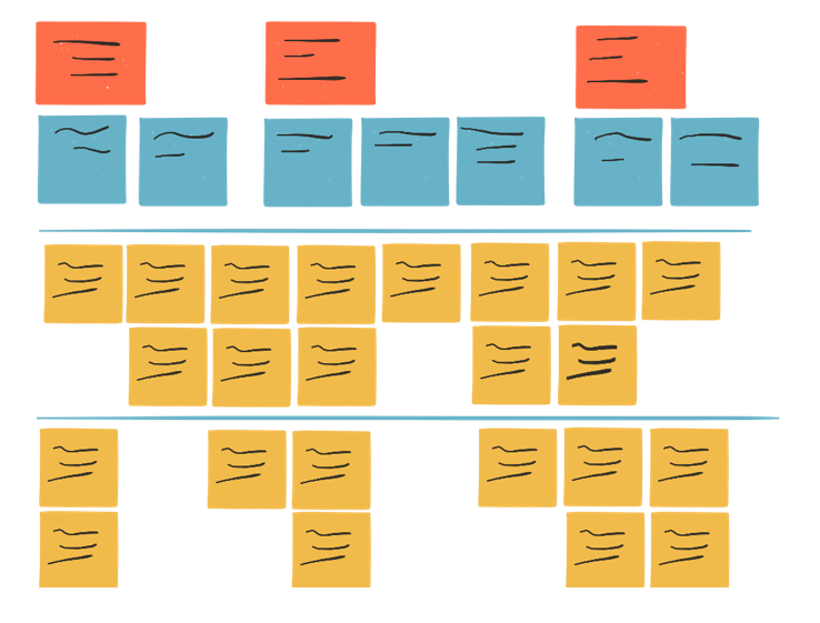
Then I started sketching out ideas and rapidly iterating. Working closely with a prototyper enabled me to explore and communicate a wide range of concepts to the team and our clients.
Through this process we discovered a few major themes and design principles:
Don’t make me read
Busy executives often don’t have time to read the details of a report and just want the big pictures. At the same time, they want evidence for why they should trust this data. It was important to our team to demonstrate rigor without overwhelming the user with numbers or math.
Tell me what to do
Our clients were only interested in their score if it was accompained by actionable insights that they could bring back to their team for implementation.
Help me outpace my competitor
The ecommerce space is very competitive, especially among similar brands. When we gave demos of this tool, it was fairly common for a client to type in the name of their largest competitor before searching for their own brand. We wanted to explore ways to leverage this competition to provide motivation for change.
Show me results
Our goal was for brands to be able to use the BBI to track their performance over time. This would prove out the value of the recommendations provided by Branding Brand.
Validation
Once we had several robust prototypes, we brought them back to our clients to get their feedback. Overall, the response was very positive. Clients liked that it helped them get a sense of where they were in the industry and what they needed to be offering to be on par with their competitors.
Refinement
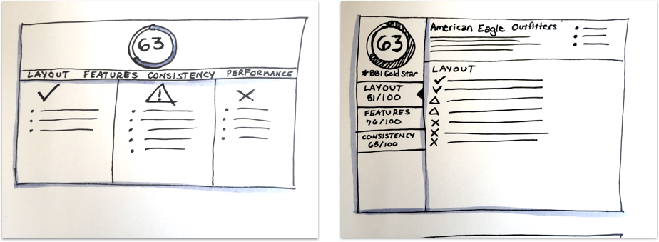
At this point, now that we knew we were on the right track, we brought in an outside design agency to help us get everything ready for a beta launch as soon as possible. We worked in tandem to pursue a few different directions at once and then evaluate how well different approaches helped us achieve our goals.
Most of the exploration revolved around striking the right balance between making it easy to scan and surfacing valuable details. Over the next few weeks, we started converging on our final design.
MVP
The public beta of the BBI launched in the fall of 2015. The final design supported many of our original design objectives:
Don’t make me read
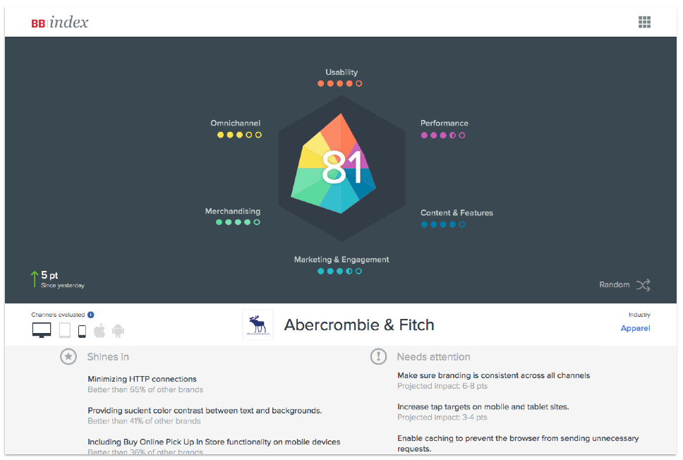
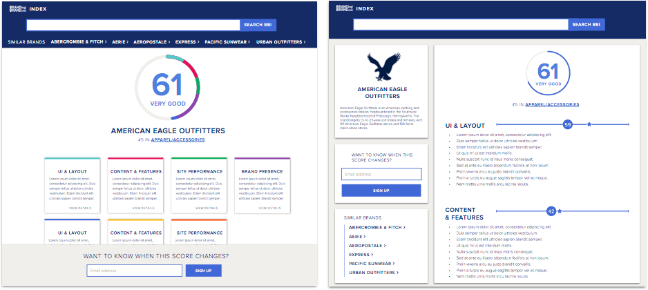
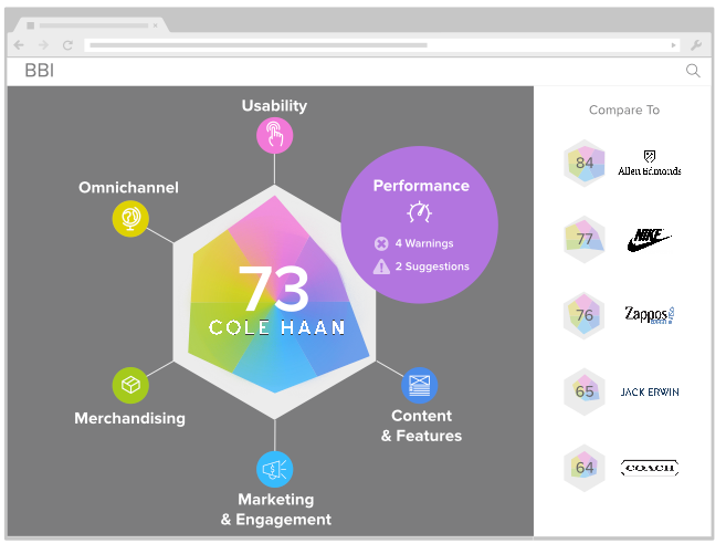
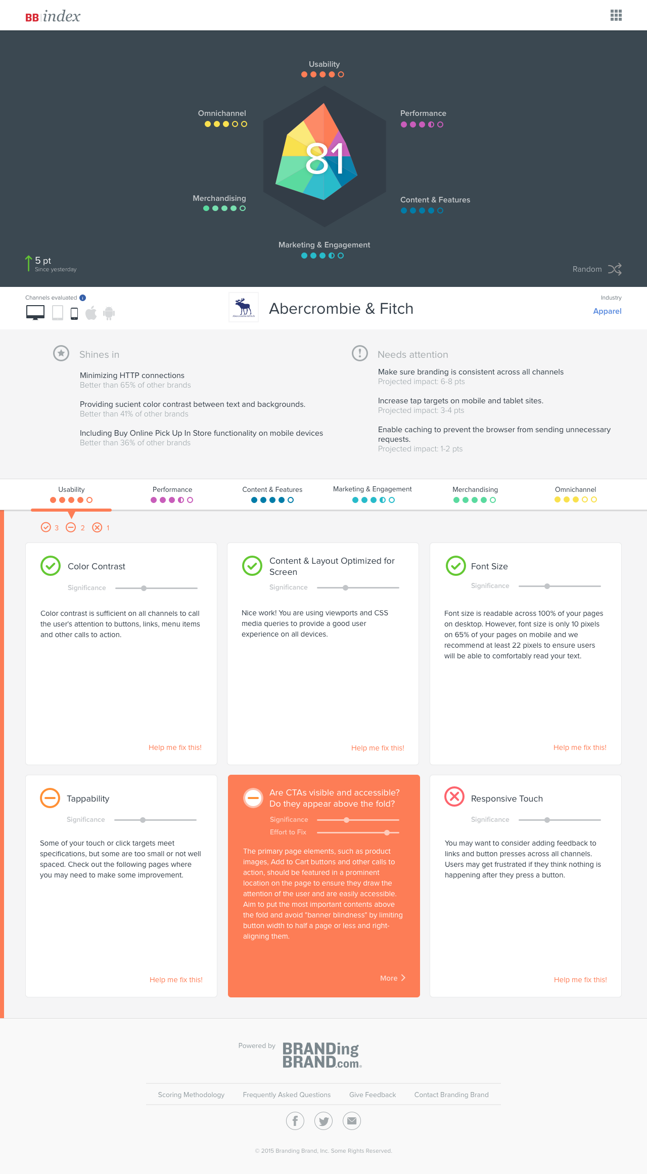
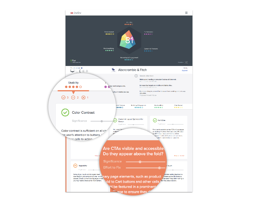
At the top is a large visualization based on the idea of a radar chart. The end result is a gemlike shape that’s different for every brand based on their strengths and weaknesses. Instead of giving each category a numeric score or a grade, we went with simplified dot indicators.
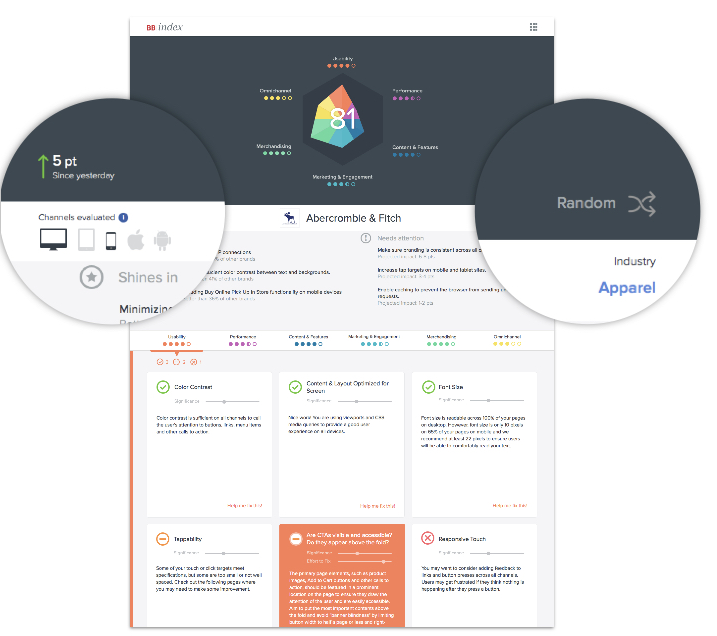
A unique feature of this tool that we wanted to highlight is that it evaluate the omnichannel experience, as opposed to just a single url or site. We added an indicator at the top to show which channels were evaluated so brands could easily know what went into their score.
Each category also has a breakdown of how many passes, ok, and fails there are in that category. Each card represents an evaluation factor and is assigned a pass/fail icon to quickly identify low-scoring factors.
Tell me what to do
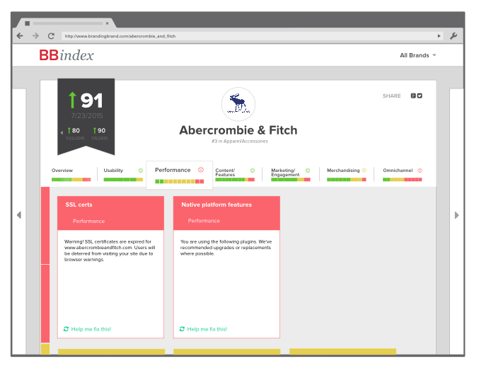
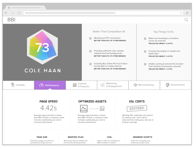
Users can flip over individual cards for more information and a detailed description. We also included an indicator of the significance of each factor and level of effort to fix, so that brands could more easily prioritize what to tackle first.
Help me outpace my competitor
We categorized each company by industry and provided a way for brands to compare themselves to others in the same vertical. For the beta, we knew we’d only have 20-30 brands, so we wanted a way for people to explore without feeling frustrated by empty search results. We added in a random button as a way to jump between different brands.
Show me results
The score visualization also provided a way for brands to share their score with others in their company and easily visualize any changes that were achieved over a period of time.