Opportunity
The portal for UPMC Health Plan members, MyHealth Online (MHOL), contains tools and information designed to help people manage their health insurance. It is used by over 377,000 registered members. However, like many legacy products, it was designed and developed in pieces by many people over long period of time. Most of the content and design of the portal had never been revisited since its initial conception. This resulted in a disjointed and confusing user experience. In addition, the age of the underlying technologies it was built on limited any opportunities for improvement.
Our IT department began an initiative to fully modernize and unify the underlying technologies of the portal. Consumer Innovation recognized an opportunity to refresh and standardize the visual design, as well as better organize information and content. Another large portion of this project was converting the current fixed-width designs into responsive designs, so that they would scale gracefully to any screen size.
Mapping Current State
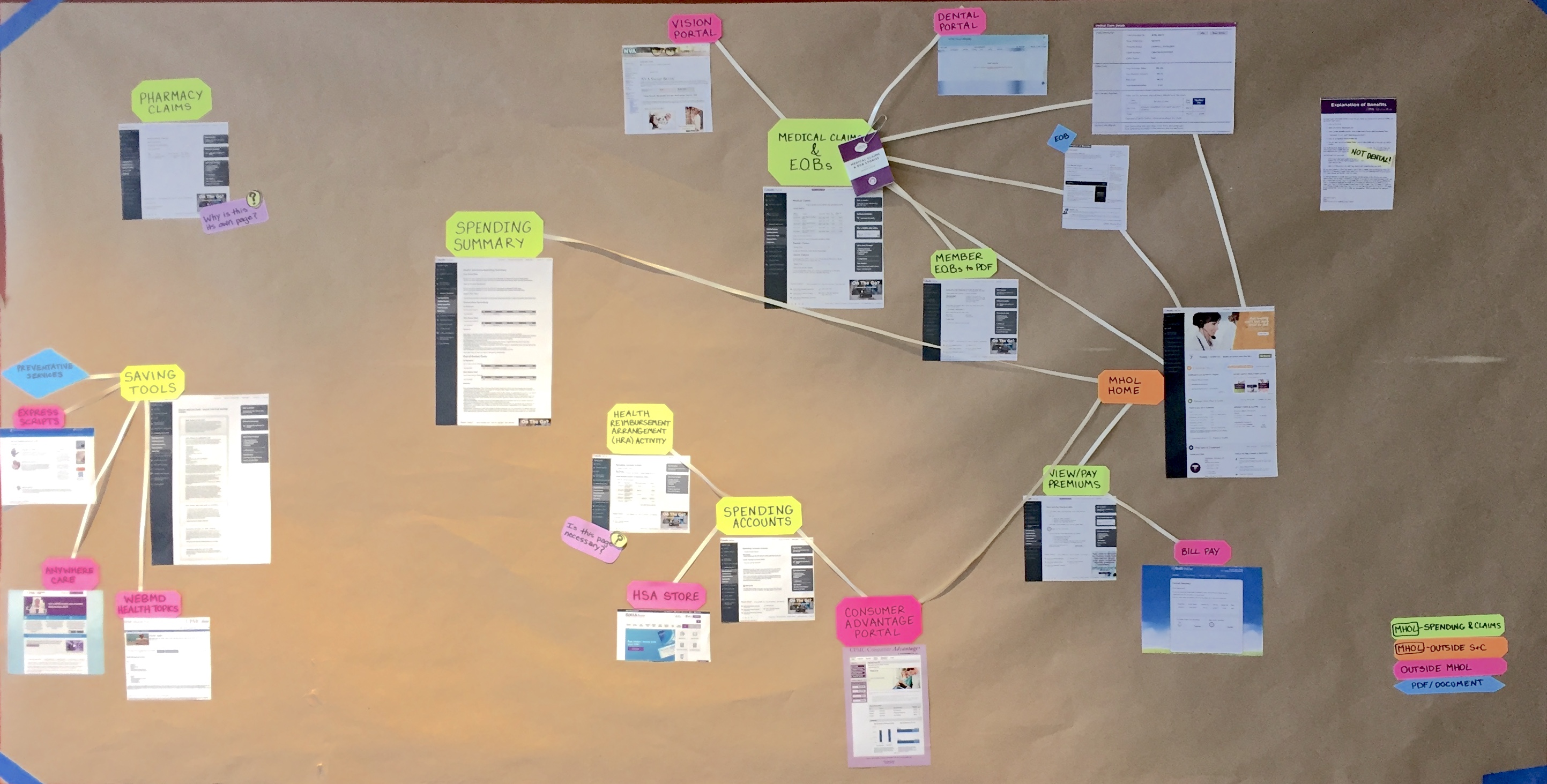
Our first step was understanding the current ecosystem of pages: objectives, functions, and connections. We spent time mapping out the current state of each section of the portal and uncovering connections and dependencies that might influence our designs or approach.
Evaluation of Pages
This project had an ambitious deadline, which meant we needed to be strategic about our approach. We used analytics, stakeholder interviews, and heuristic evaluation to assign each page within the portal a “level of service”. This dictated whether we would be simply refreshing the visual design of the existing content on a page or using a more in-depth approach to evaluate and reorganize the content and improve the experience.
Process Improvement
At the time of this project, much of UPMC’s technology process was agile in name but closer to waterfall in nature. This resulted in developers needing to see completed, approved designs before any development could begin. Often, this caused designers to jump straight to high-fidelity designs to avoid becoming the bottleneck for development, but this limited exploration of new ideas. One of our goals with this project was to introduce more iteration and experimentation into our process, while still working within a more traditional, risk-averse organization.
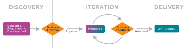
We created a new process to use throughout this project. The first step was a discovery phase in which product managers would write job stories and designers would explore concepts and gather data from stakeholders. The end result of this phase would be a low-fidelity “alpha” design, intended mainly for alignment around content and structure.
We then would solicit feedback and approval from stakeholders. The goal of these meetings was to confirm that we were heading in the right direction. MHOL is used across many lines of business, and as a result these stakeholder meetings often involved upwards of 30-50 people who needed to review and approve our designs. Once we had sign-off from stakeholders, we moved into an iterative “beta” phase. During this time, work could begin on back-end services and infrastructure while designs and front-end work gradually increased in fidelity and moved toward final designs. Stakeholders had an opportunity to review progress at each sprint demo and provide feedback until development was complete.
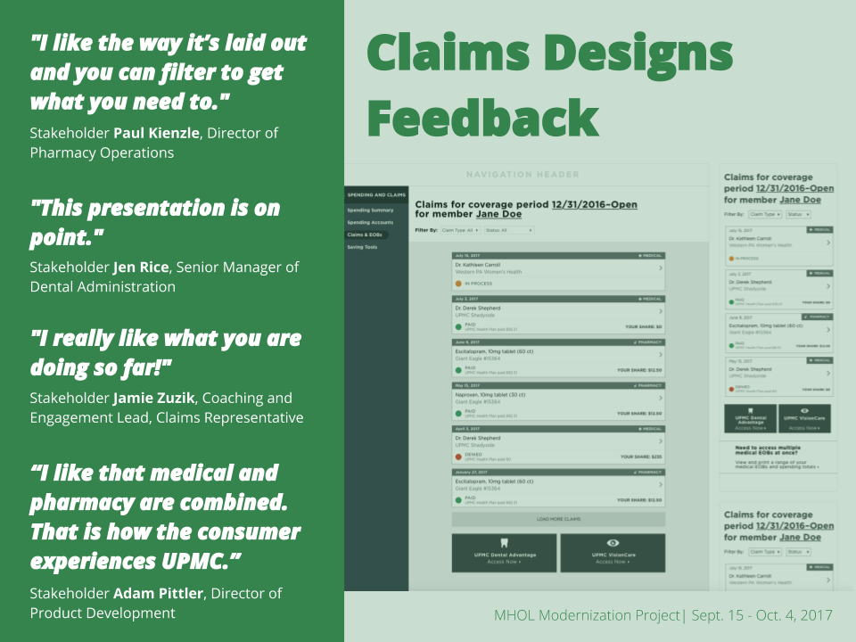
An Example: Claims
Here’s how that process worked in practice with one of our more heavily-utilized and important pages: claims.
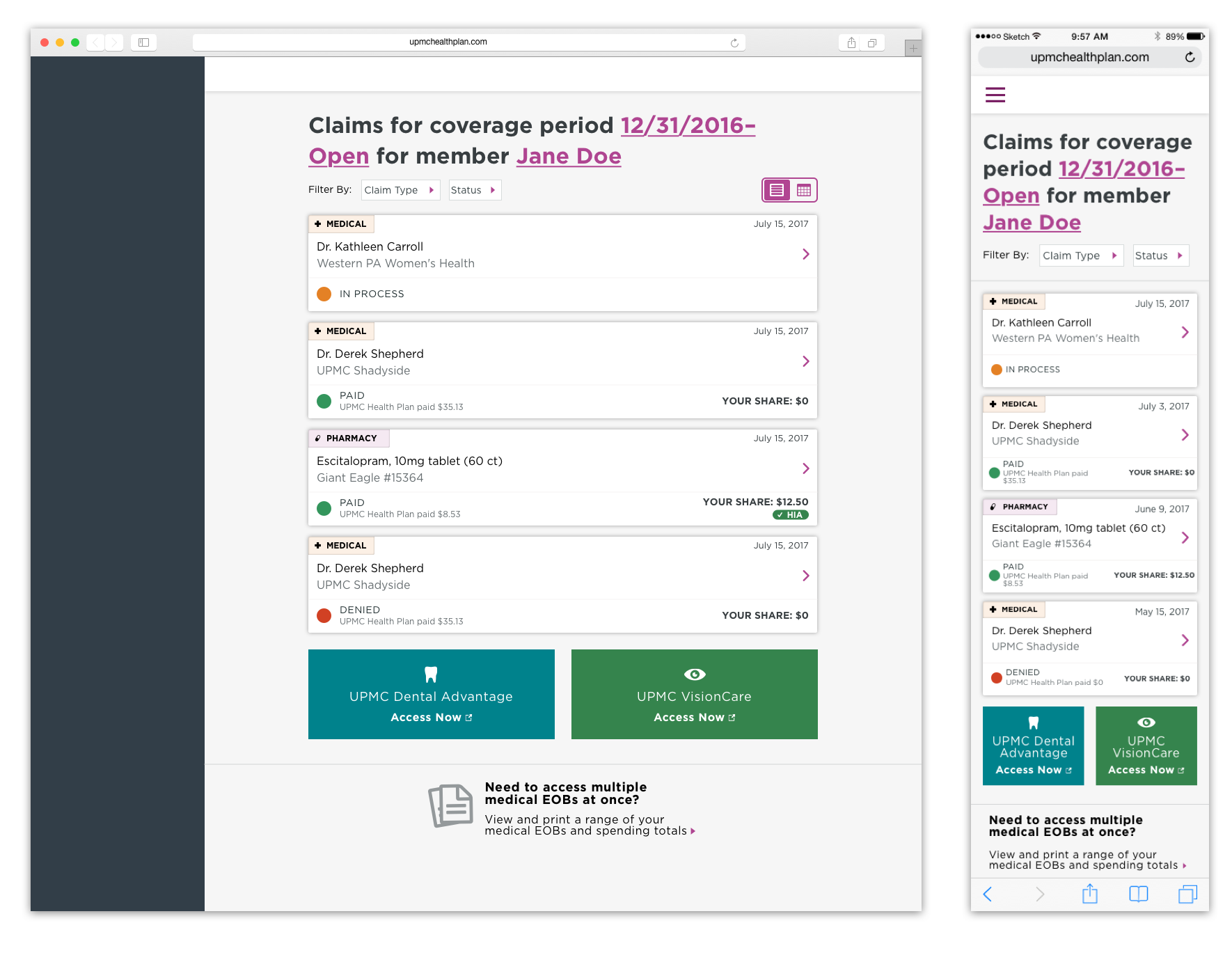
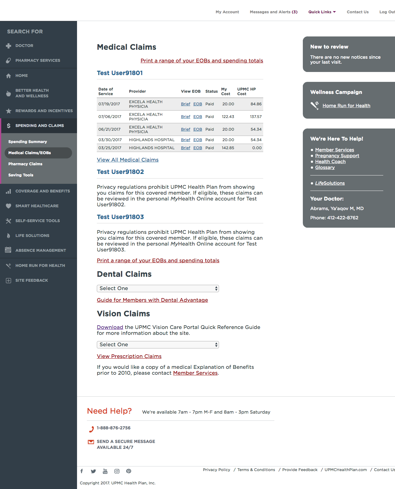
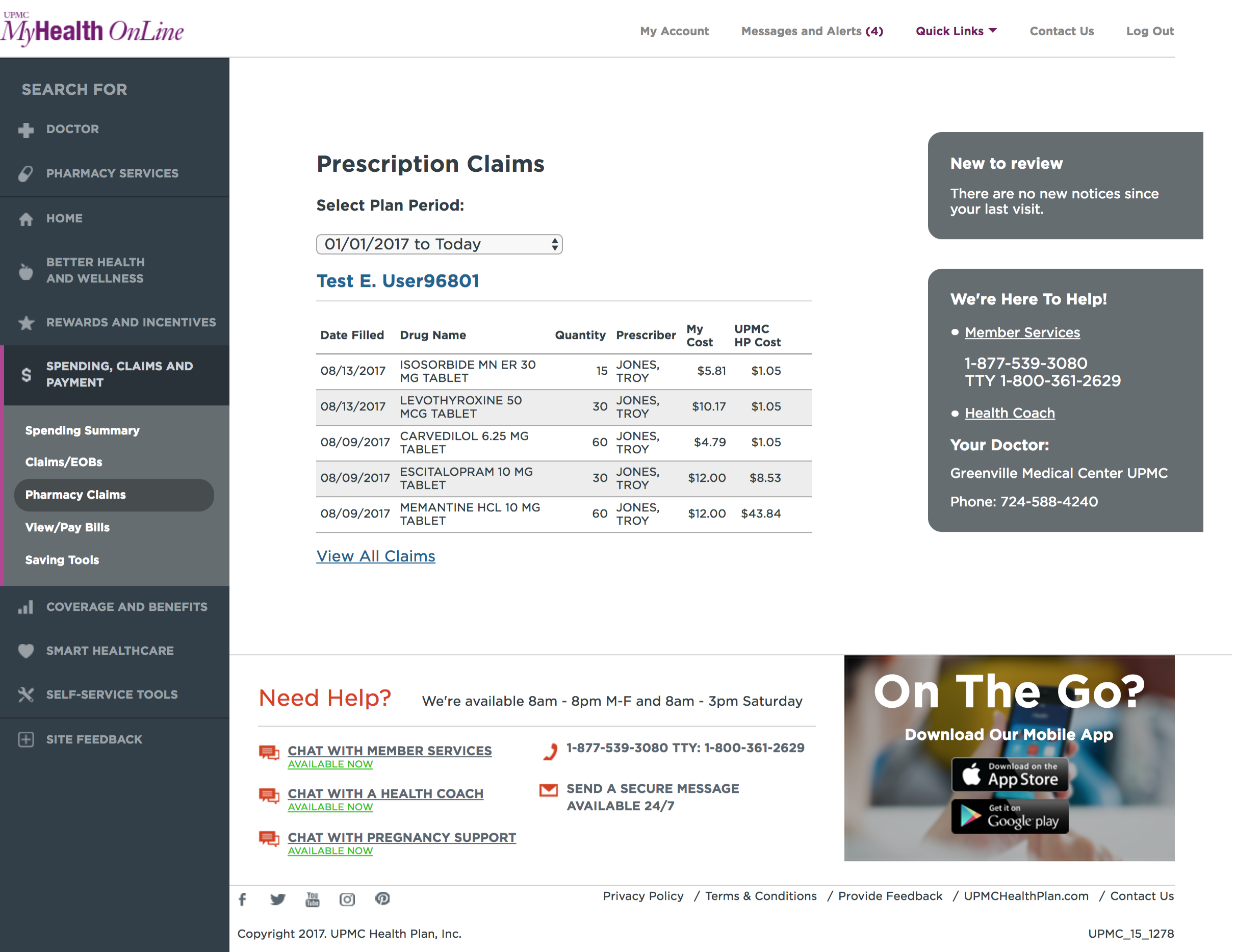
The current state of the claims page was confusing and dense. It contained external SSO links to view dental and vision claims (accessed, confusingly, through a select input) and pharmacy claims were located on different page within the portal. Hierarchy and visual consistency were sorely lacking.
We began experimenting with different ways of showing this data. Some early alpha concepts explored bringing all claims into the same page, or separating them out through separate links.
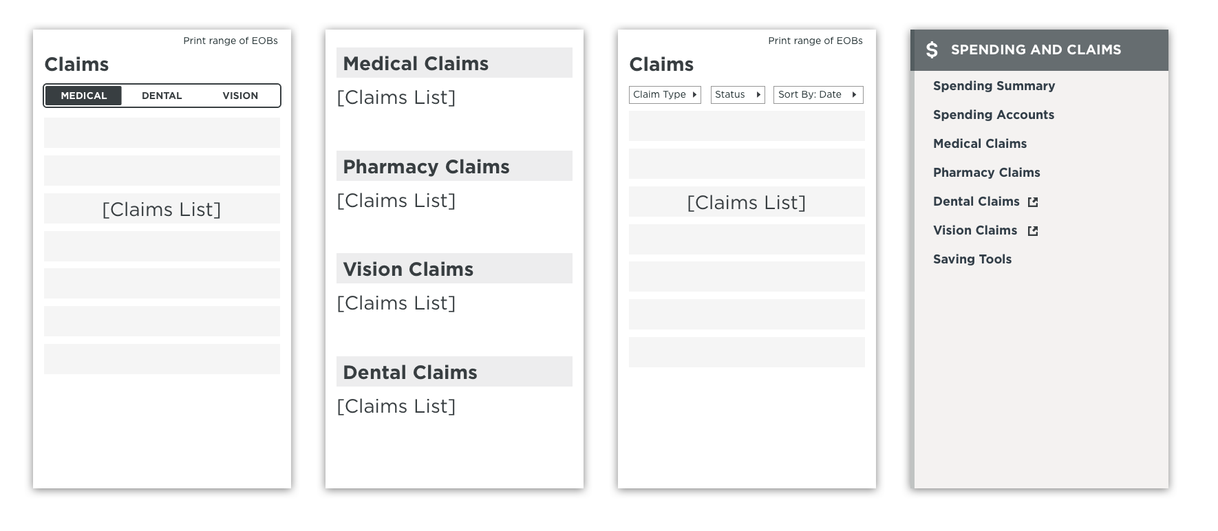
We also explored different ways of displaying the data for each claim.
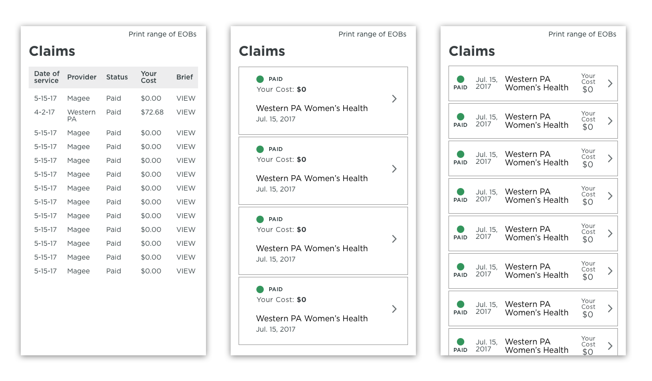
After early rounds of feedback, we began to coalesce around bringing together the different types of claims into a single, unified claims experience. We realized that most members don’t think about having different types of insurance through UPMC; they simply think of it as their health insurance. We wanted to provide an easier way for members to see their most recent claims in one place.
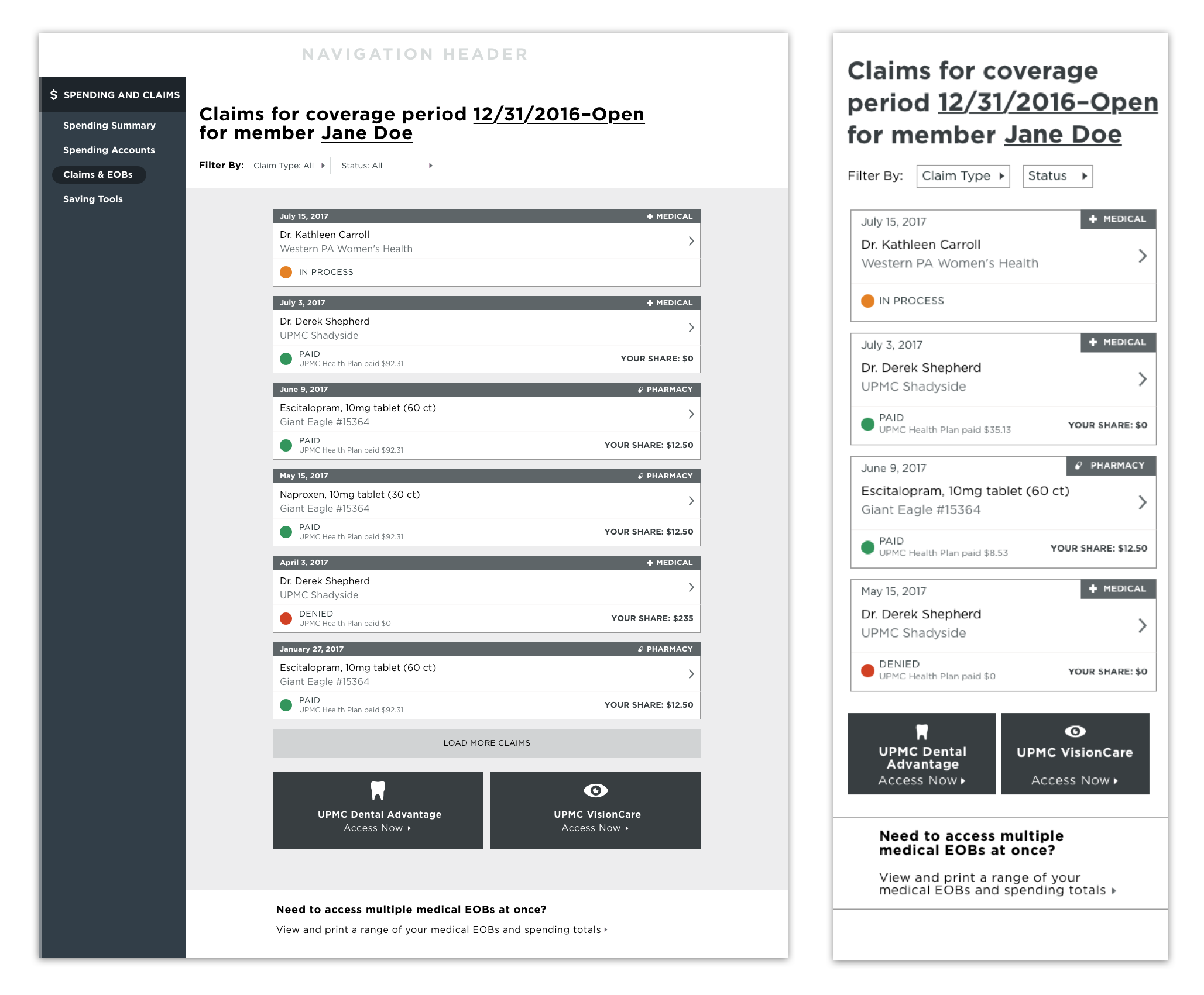
Our reviews with stakeholders confirmed this direction. Though we would still need SSO links for certain vendors, we could make them more visible and obviously clickable.
Front-end and services work began while we continued to iterate and refine our early concepts into high-fidelity visual designs.