Opportunity
In the past couple of years, the design team at UPMC Health Plan has more than tripled in size. The team has also been tasked with ensuring consistent, quality user experiences across several different products and portals within UPMC. This level of growth and increased responsibility has highlighted a need for a consistent visual language across products. Our team was spending too much time on the small things, like what a particular call to action should look like, and this didn’t leave time for the bigger problems our products and users were facing.
Interface Inventory
A quick inventory of just one product (MyHealth Online, our member portal) revealed a large amount of inconsistency. For example, there were over 30 different styles of buttons:
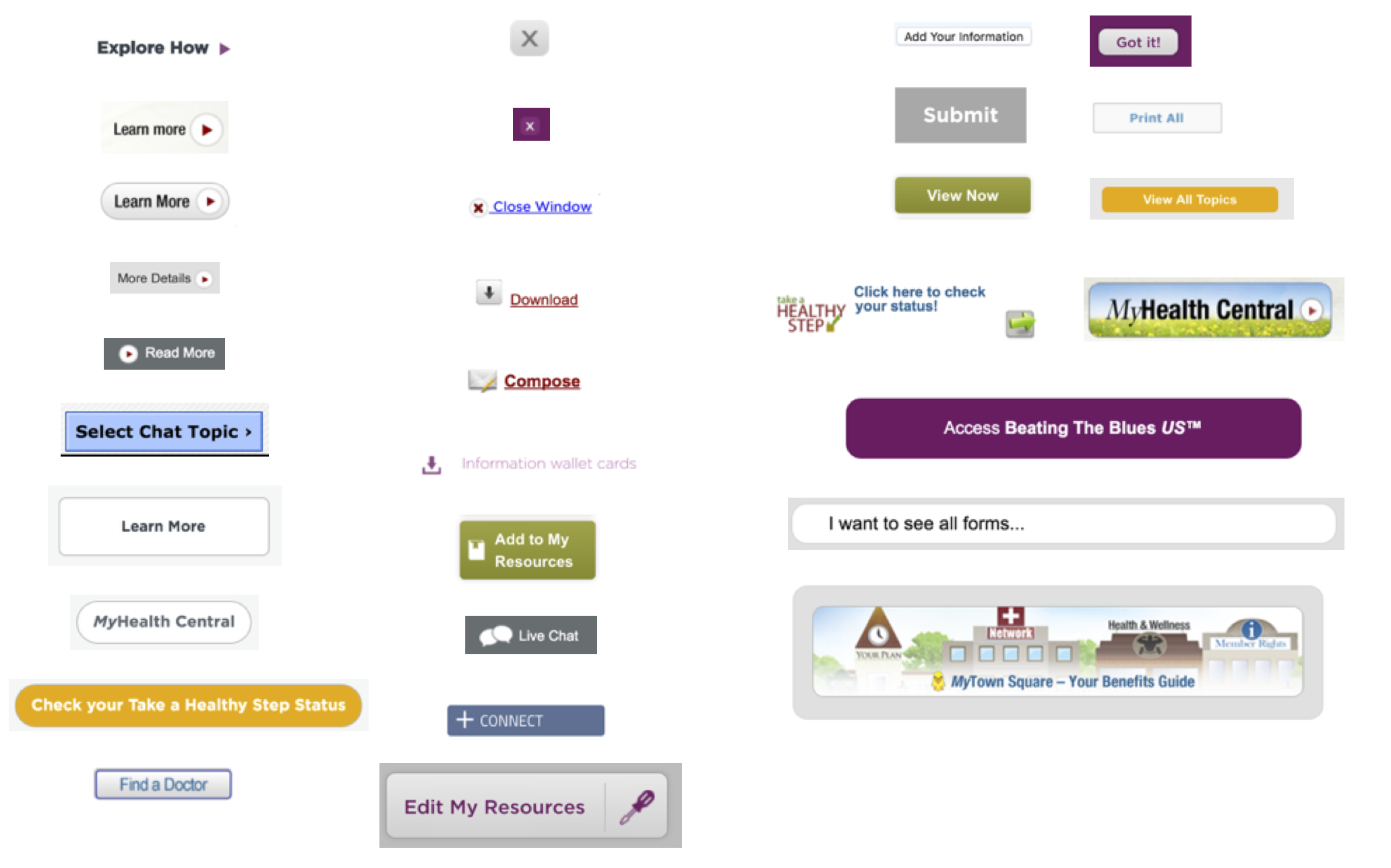
And many different styles of icons, as well as redundant, similar icons:
![]()
Initial Sprint
We gathered the team and spent six weeks on an initial sprint to define some of the more basic elements, such as color, typography, buttons, form fields, etc.
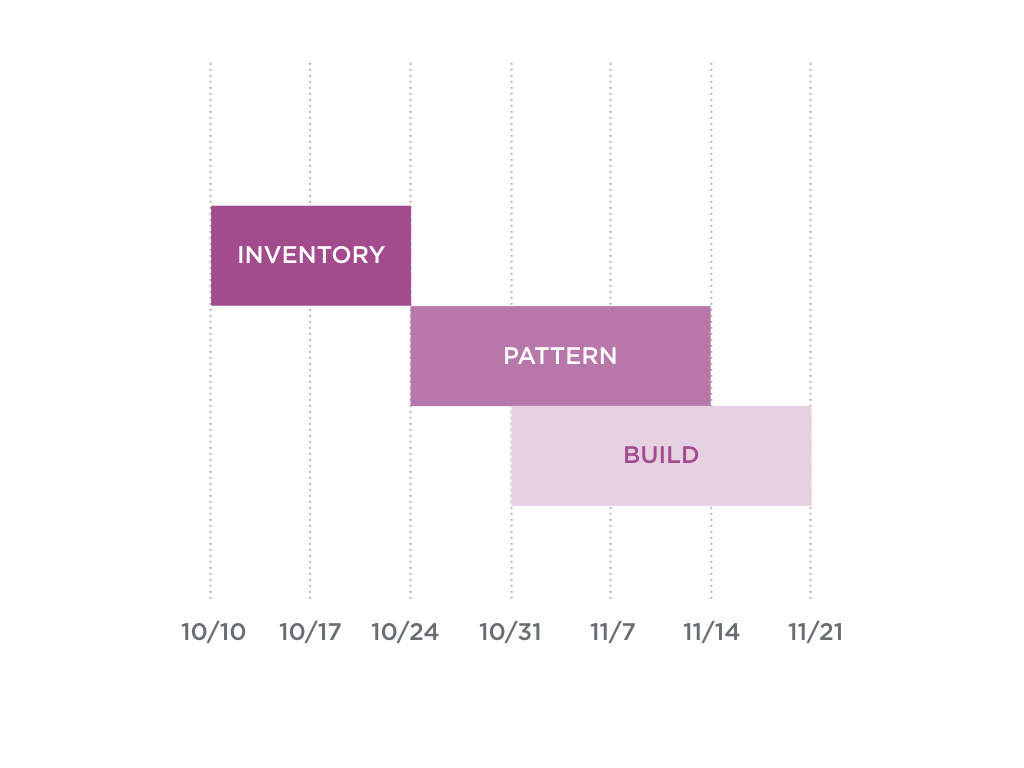
I facilitated discussions around best practices, exisisting patterns, and guidelines around how to use these different elements.
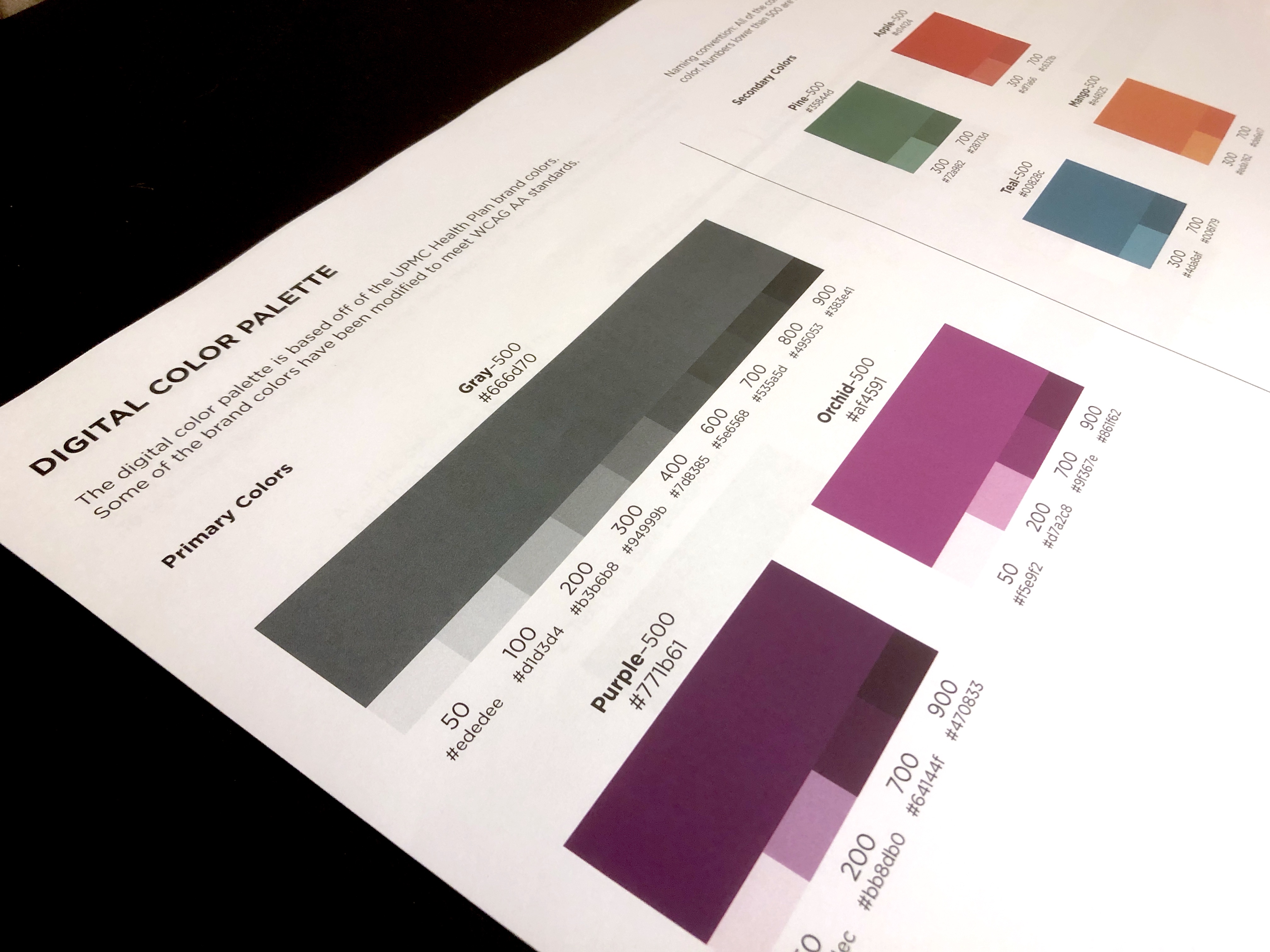
The end result of this initial sprint was an established, digital color palette, typography scale, and Sketch and Axure libraries with common components.
Selling the System
Although this first sprint was a huge step in the right direction, I knew that our efforts would be quickly out of date unless we were able to connect with development efforts and create a living, single source of truth for all components. However, navigating an organization as large and complex as UPMC proved to be a challenge. I needed to unite several different groups and department, each with their own priorities and deadlines. This involved a few months of presenting the value of the system, the current progress, and the future vision.
Creating a Process
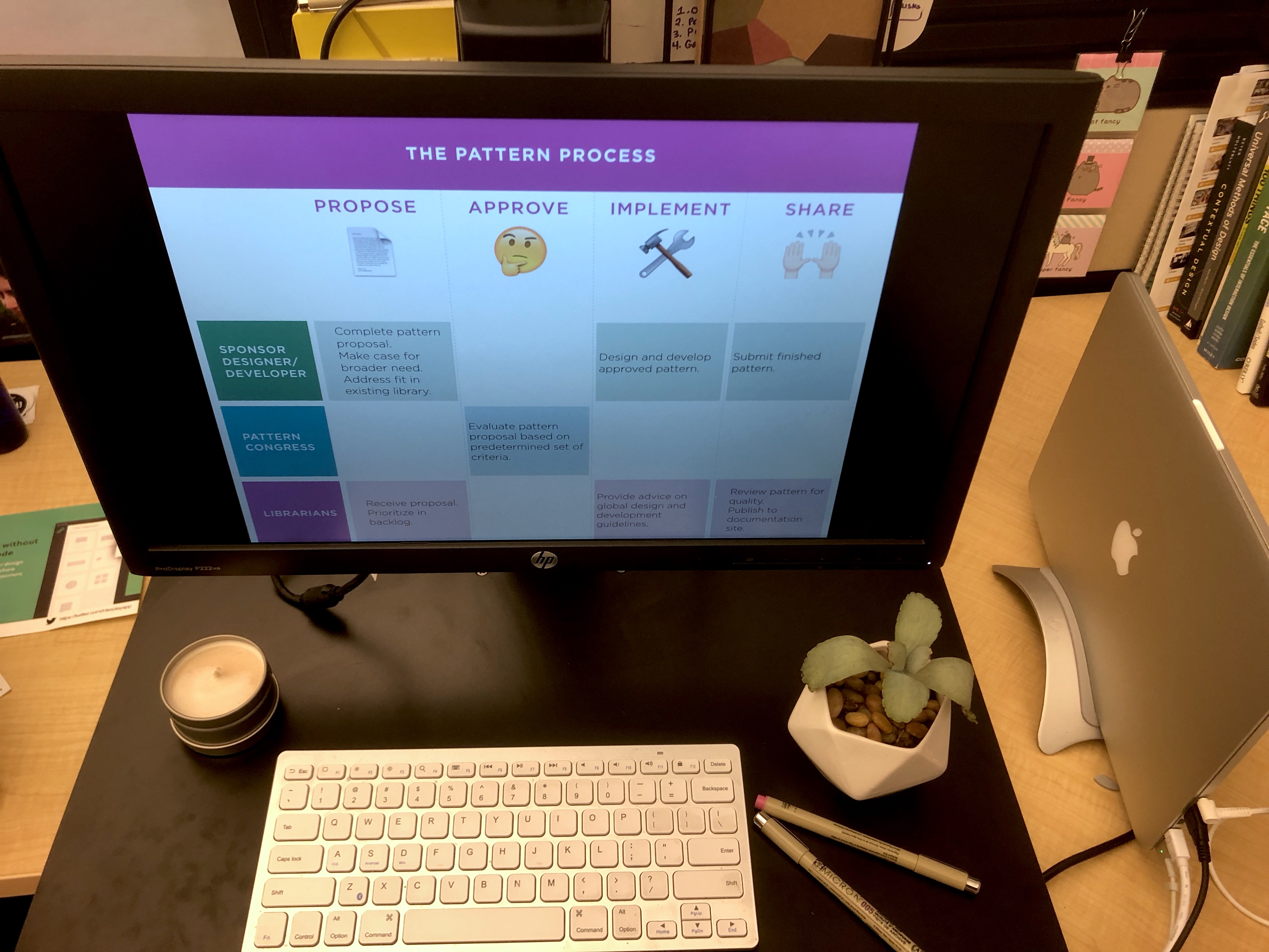
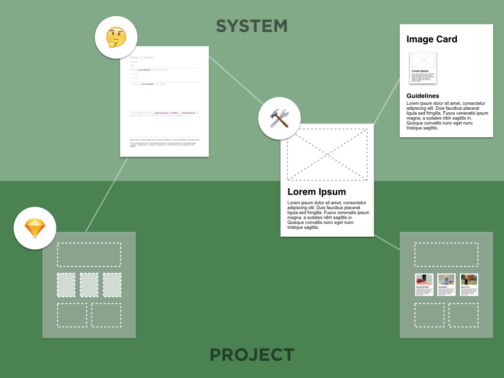
I realized that our easiest path forward was to tie into existing development projects, such as the MyHealth Online modernization that was currently underway. I created a pattern proposal process, where any designer or developer could fill out a simple form with an idea for a shared component. Additionally, I gathered together a group of designers and developers with a wide range of skillsets to form what we dubbed the “Pattern Congress”. This group met regularly to debate any open proposals or help prioritize system needs.
Ongoing Efforts
Although this initial process gave us a solid start, I began to notice some pain points. Tying ourselves to exsisting projects also meant tying ourselves to their deadlines, technology choices, and processes. It became evident that this would limit the usefulness of the system to other products with different roadmaps and technology bases.
The next evolution of our design system is switching from an Angular component library to a CSS-only framework, which can be technology agnostic. This will help allow for faster system development and a reduced number of code conflicts and restrictions. Another key step that is currently underway is establishing a dedicated team to continue growing the system, educate stakeholders on how to use it, and provide tools for designers and developers.
